Designing Opusonix: Solving Mix Review Challenges with Better Communication
Table of Contents
Mix reviews shouldn’t be this messy. Between timestamped comments buried in email threads, lost file versions, and vague feedback, we kept running into the same issues—whether as engineers, producers, or collaborators.
So we built Opusonix to solve those communication breakdowns. This post walks through the specific problems we wanted to fix, and how each design decision aims to do just that.
1. Feedback Should Be Easy—and Precise

Writing detailed feedback usually means switching between your audio player, notes app, and email. It’s slow and clunky. Most people default to general comments just to get it done, which isn’t great for mix quality.
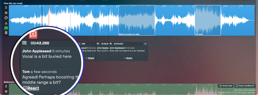
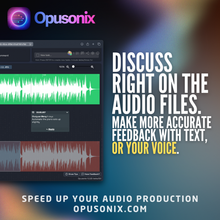
With Opusonix, you can leave timestamped comments directly on the audio—no need to jump between apps. And when words aren’t enough, you can record voice notes to demonstrate phrasing, rhythm, or tone. The goal is to lower the friction so clearer, more complete feedback actually gets shared.
2. A/B Testing Is Built In
Most clients and engineers we spoke with have struggled to compare mix versions in a meaningful way. You end up juggling files or links, trying to match playback across platforms.
As composer and music professor Christopher Biggs put it plainly:
“Without a good way to do comparison, people just can’t make good decisions.”
So we built A/B comparison directly into the review interface. You can toggle between versions and leave comments with the context right there. When you pair that with timestamped feedback, it’s a lot easier to identify improvements—or missteps—between iterations.
3. The Email Pileup Is Real
We know that a single track project could generate dozens of emails—just from versioning and feedback alone. Engineer and musician Ralph Kinscheck told us:
“Each project averages about 5 versions; and each version we send out usually means another wave of links, replies, and updates. It’s easy for someone to miss something important.”
Instead of threading feedback through endless email chains, we designed Opusonix to be a shared workspace where comments, reactions, and new versions all live together. No jumping between tabs. And to keep everyone updated without adding more manual check-ins, we built:
Daily summaries to capture the latest changes.
Weekly recaps every Friday with a snapshot of what’s done and what’s coming.
A Notify Editors button so teams working asynchronously can push quick updates to everyone at once.
This alone can cut 80% or more of the typical back-and-forth.
4. One Project, One Link.

We also know about the pain of managing links from multiple sources: SoundCloud for previews, Google Docs for feedback, Drive for file delivery, and endless email threads tying it together.
As artist and producer Jordan Munson described it:
“My workflow normally involves emails for feedback, SoundCloud for album testing and more feedback, and Google Docs—one for each track, and maybe another for the full album. That’s a lot of links. And every time changes are made, they’re explained over email.”
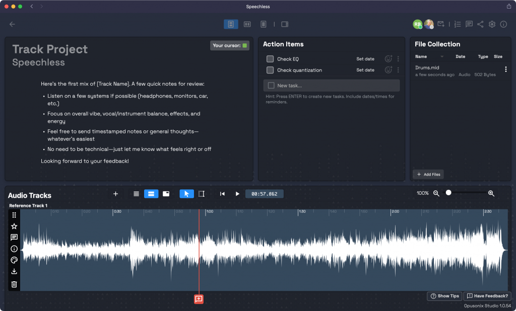
We realized part of the confusion wasn’t just the number of links—it was the separation between feedback, file versions, and project notes. So we built Opusonix with a single project workspace per track (or album), where everything lives together: audio versions, timestamped feedback, notes, and actions.
One link. One place. No guesswork.
5. Everyone Should Know What’s Going On
Several clients told us they were often unsure what had been done, what was pending, or what still needed discussion—so they’d send check-in messages. But that means engineers have to stop working to answer status emails.
We wanted to make progress more transparent without requiring a full project management system. So every Opusonix project includes:
A shared action list to show what’s in progress or completed.
A notes section for bigger-picture discussion or project-level goals.
Clients can log in at any time to see what’s happening. Engineers can lay out a roadmap clearly. It’s light, but enough to reduce the “Hey, just checking in…” messages.
6. A Better Client Experience Reflects Your Professionalism

We also understand how important it is for engineers and producers to present themselves professionally—especially when working with new or high-profile clients.
That’s why we paid special attention to the client-facing experience in Opusonix. When you invite a client to a project, they receive a clear, branded email that tells them who invited them and which project it’s for. The onboarding process is simple: they click “Accept Invitation,” see a welcome screen confirming the invitation, and enter their name and password. No confusing signups, no email verifications, no ambiguity.
We also support project workspace customization, so you can match the branding or vibe of your studio, label, or artist identity. This helps you present a unified, polished experience from the very first interaction.
And as mentioned earlier—there’s just one project link. Clients can return to the workspace by clicking the same button in the original invite, or any future update email. There’s never any question about where to go or which version to open.
Why It’s Built This Way
We didn’t set out to build a flashy app. We set out to reduce the communication drag that gets in the way of good creative decisions.
Every feature in Opusonix is built to remove friction:
Easier feedback = better detail
Built-in comparisons = clearer decisions
Centralized comments = fewer missed notes
Single workspace = no lost links
Integrated tasks and calendars = fewer check-ins
These aren’t silver bullets—but they address the real, repeatable problems we’ve heard from working professionals. And hopefully, they help make mix review a little less frustrating—and a lot more focused.
